12 static ad formats that keep winning for ecom brands
The layouts that keep showing up in long-running ecom ads, why they work, and how to make your own version of each.
On this page
- 1. The benefit headline
- 2. The problem and solution poster
- 3. Us vs them
- 4. Before and after
- 5. Review cards
- 6. The big number
- 7. The lo-fi offer poster
- 8. The offer stack
- 9. The note or letter
- 10. The editorial page
- 11. The native screenshot
- 12. The plain photo
- How long-running statics get iterated
- How to judge a static
- Making them fast
Statics are the cheapest ads you can make and the fastest to test, and they still win more often than most brands expect. In a pet supplements account we run, the most efficient new concepts of one month were all statics, even though video took most of the spend. Video won the click. Statics turned more of their clicks into orders.
To see which layouts last, we went through the active UK ads of 31 well-known DTC brands across supplements, pet, beauty, apparel and home, looking for ads still running four months or more after launch. Fewer than half of the brands had any, which tells you how few ads survive. The twelve formats below are the ones that kept turning up among the survivors, plus a few that work in our own accounts. Every example is a recreation for a made-up coffee brand, so you can see the layout rather than someone else’s ad.
The short version
- The longest-running statics are simple: one claim, the product, one piece of proof.
- Lo-fi often outlasts polished. A homemade-looking poster can run for months.
- Brands iterate one template many times, swapping the headline and the colour.
- Judge statics on purchases per 100 clicks. They often lose on CTR and win on orders.
1. The benefit headline
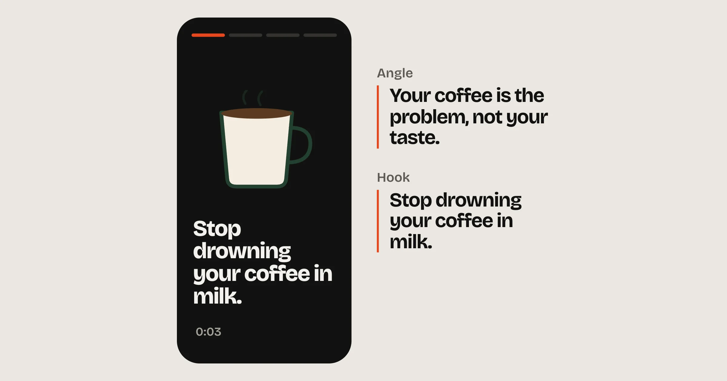
A big claim, the product large in frame, and two or three short proof points. It was the most common layout among the long-running ads we found, across supplements, grooming and beauty.
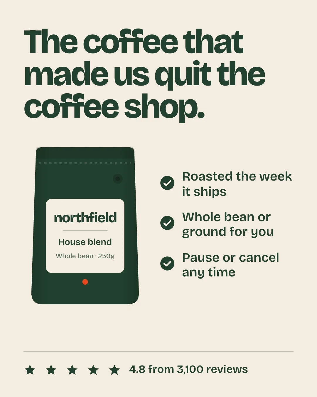
What makes it work: a claim of eight words or fewer that a customer would actually say, a product shot big enough to read on a phone, and proof that supports the claim rather than repeating it. If the headline needs a second line to make sense, it’s the wrong headline.
2. The problem and solution poster
Two labels do the work: “The problem” over a headline in the buyer’s words, and “The solution” over the product. Feature or ingredient call-outs sit around the pack. One supplements brand has run a single template like this for months, changing only the problem in the headline: broken sleep in one version, waking up tired in another.
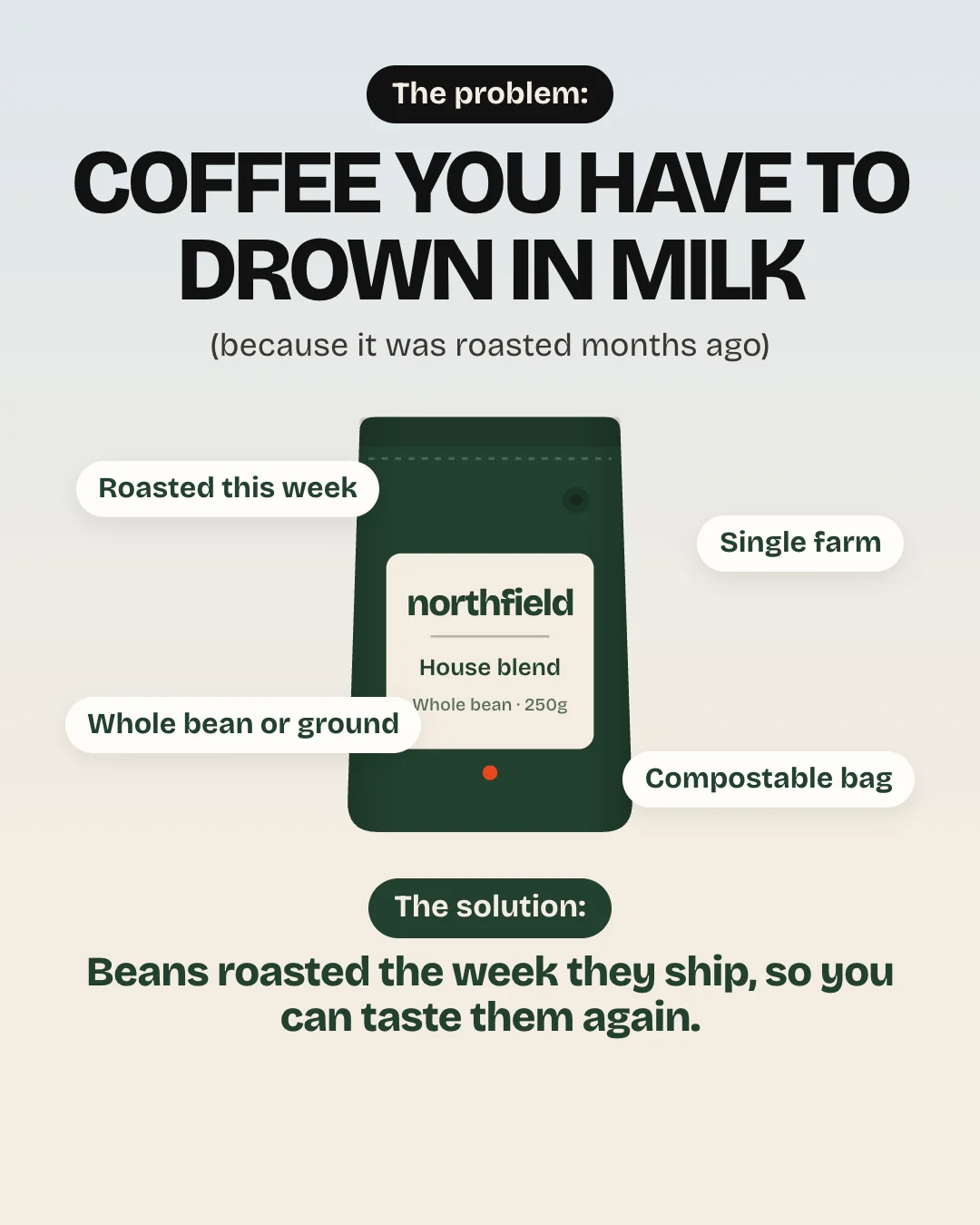
Write the problem exactly as customers describe it in reviews. “Broken sleep” beats “sleep issues” because it’s how people talk.
3. Us vs them
Two columns: you, and the thing people use instead. It answers “why should I switch?” before anyone asks. The oldest live ad we found in the whole check was a comparison: a plain photo of a laundry brand’s slim boxes stacked against a much bulkier mainstream pack, running since June 2023.
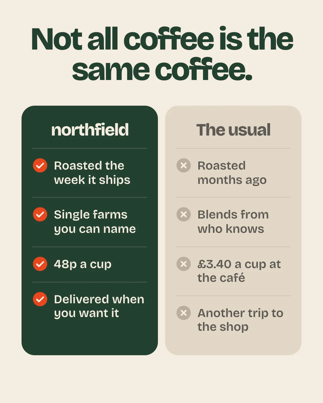
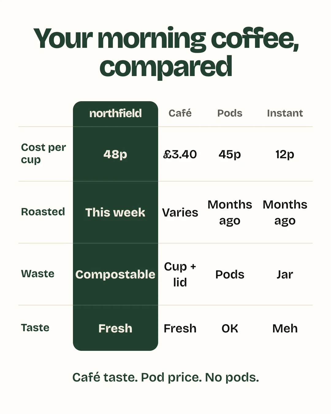
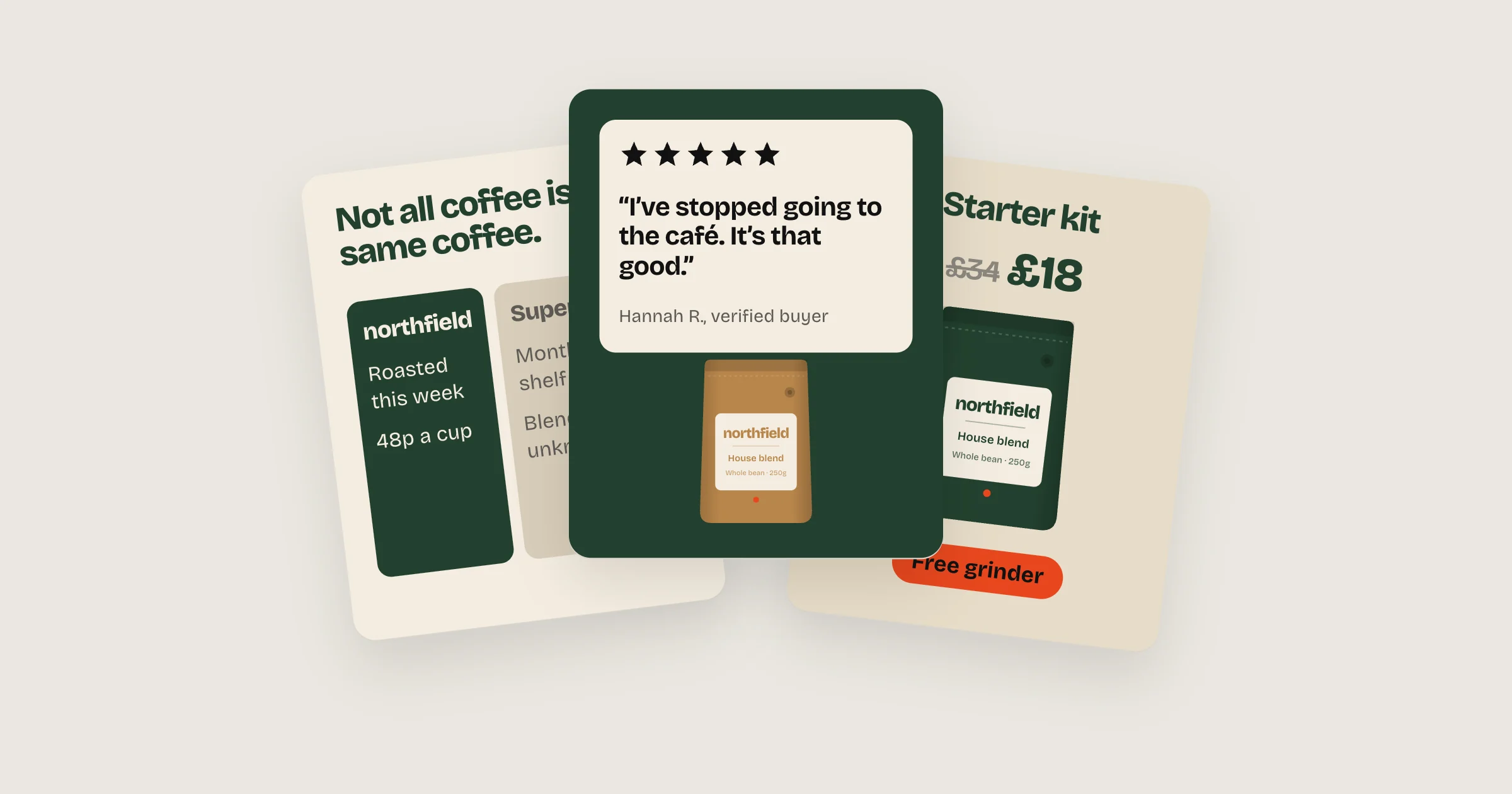
A table works the same way when there are several alternatives: the café, pods, instant. Compare against the habit or the category rather than a named rival unless every claim is fair and you can prove it. Comparative claims are allowed, but they get checked.
4. Before and after
The same situation, before and after the product. It’s proof people can see, and it works across categories. In our own accounts, ads that compared a dog then and now consistently beat the account average, and in a supplements account a customer-style before and after ran about twice as efficiently as a generic creator photo.
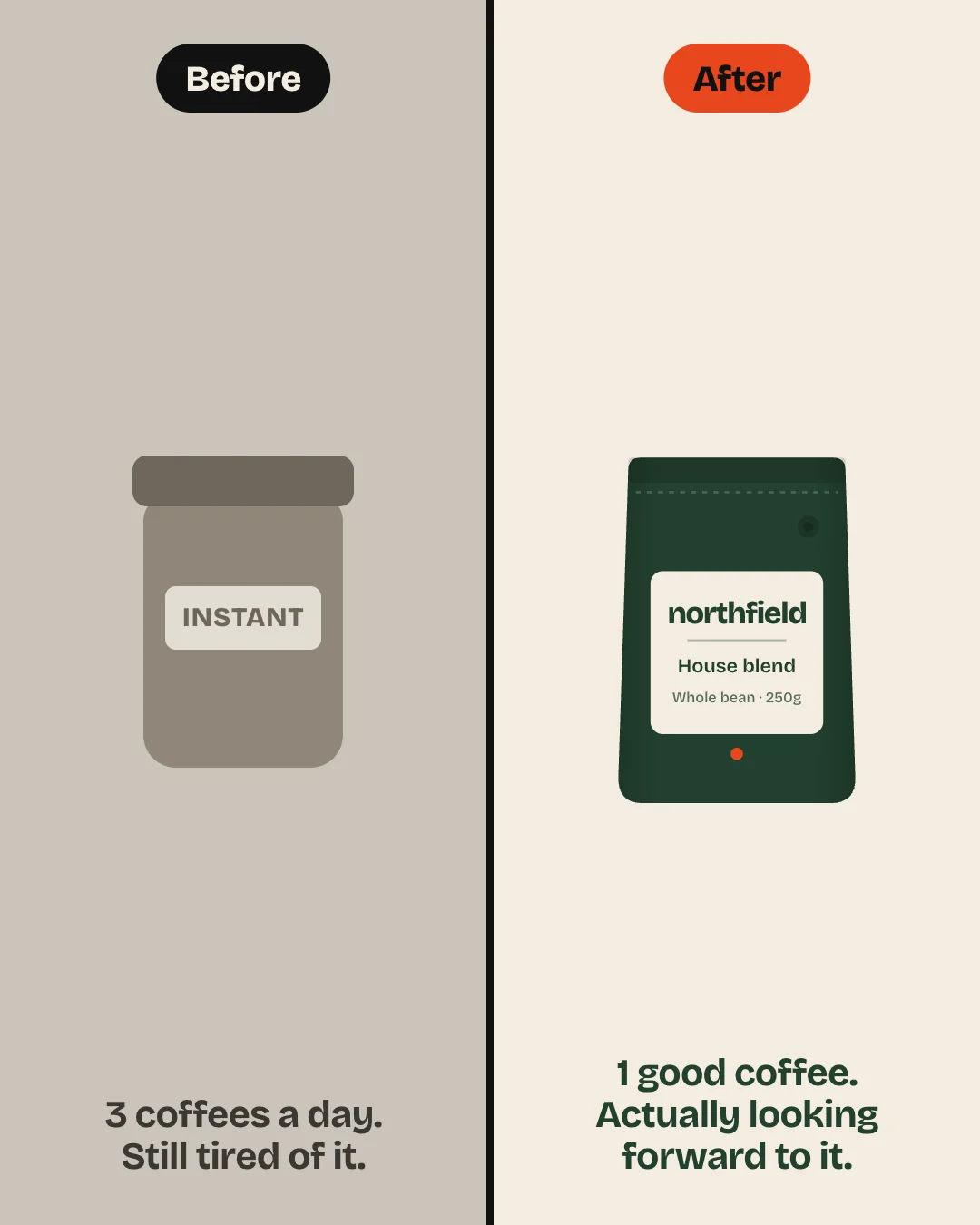
Meta restricts before and after images for anything health, body or weight related. Show a routine, a room or a result changing, never a body.
5. Review cards
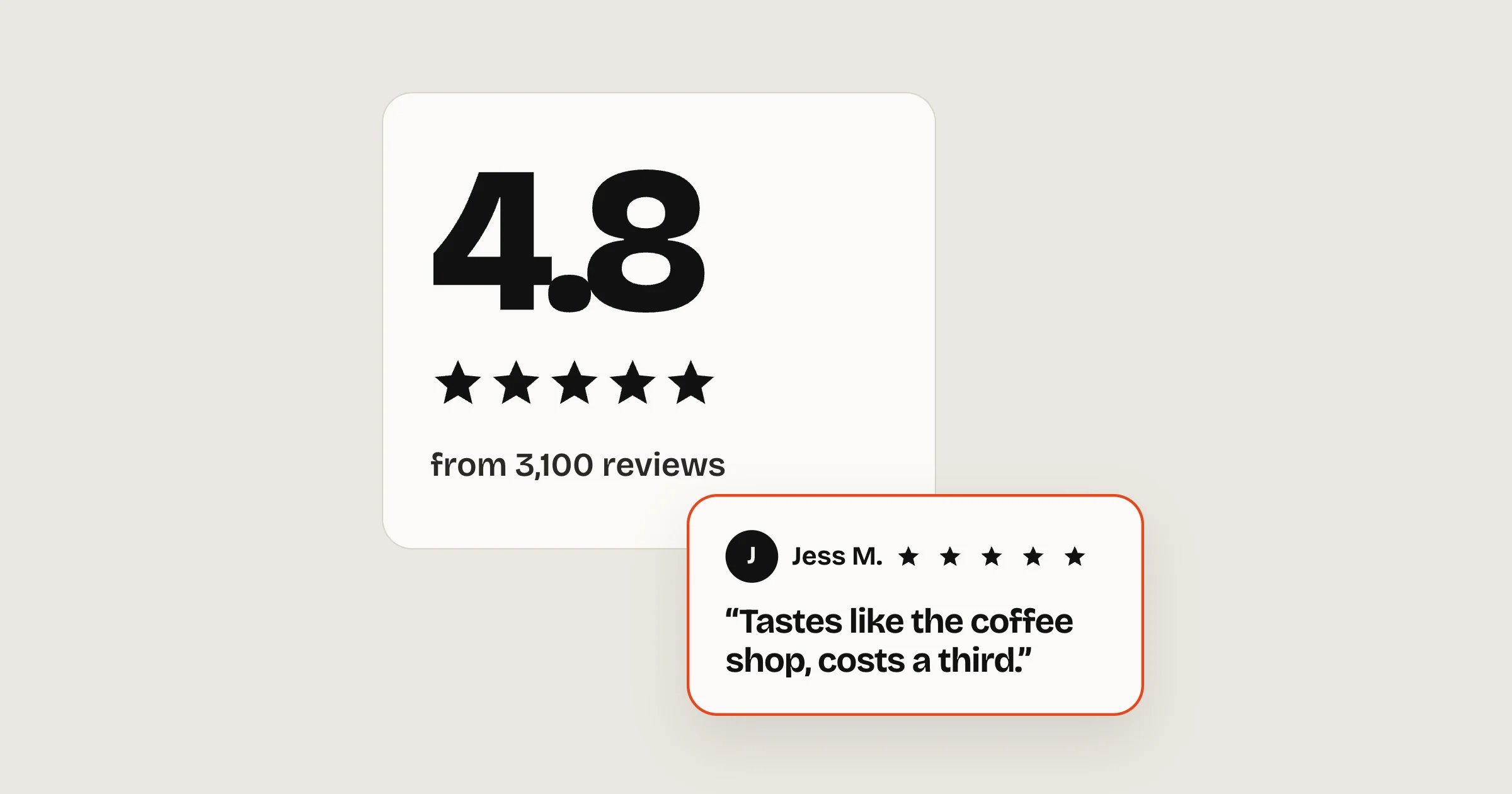
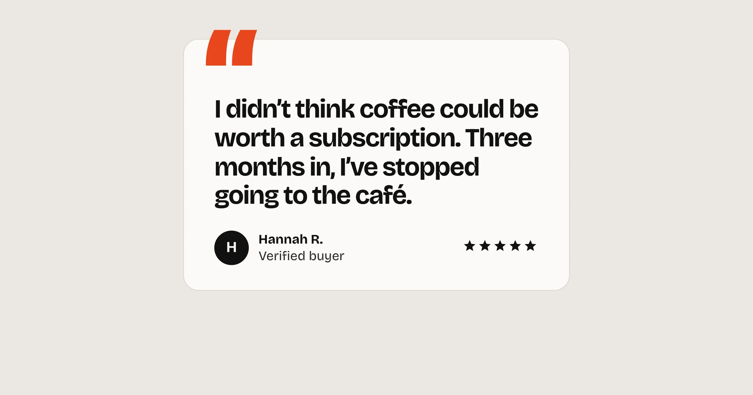
One review laid out like a review, or several floating around the product. A beauty brand’s long-running static put five short review cards around one bottle under a “cult following” headline. It reads as evidence, not advertising.
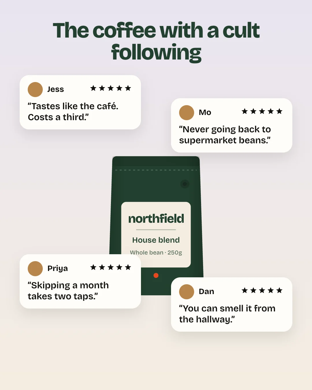
Keep each review to one line with a specific detail, and only use real ones. How to find them is in testimonial ads that sell.
6. The big number
One number does the selling: a reorder rate, a result, a price per day. Infographic versions work too. One long-running supplements static set out habits the reader already gets right, then the symptoms they still have, before introducing the product.
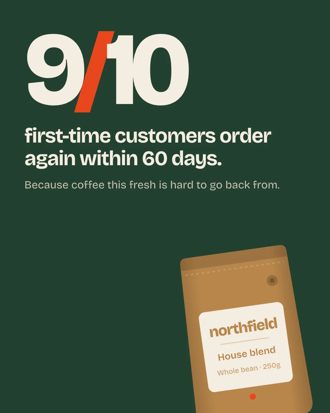
The number has to be true, recent and yours. If you can’t show where it came from, don’t run it.
7. The lo-fi offer poster
A pet food brand has run a deliberately homemade “WANTED” poster for over six months: big type, a yellow “FREE!” label and hand-placed red arrows pointing at the products. It runs in at least four colourways, with identical copy on every one.
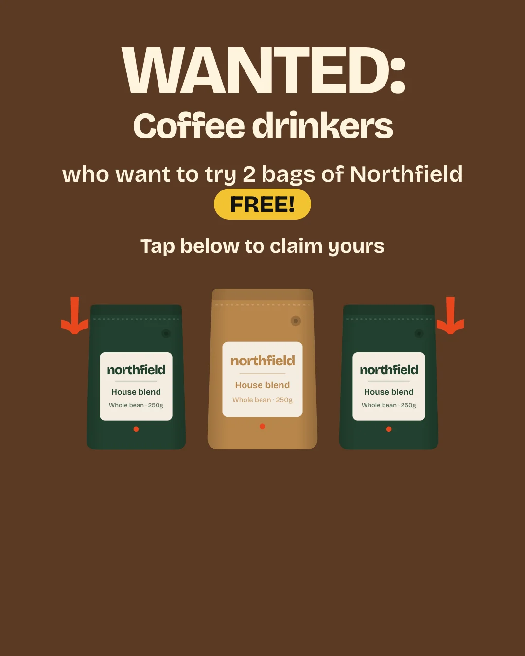
It works because it doesn’t look like a brand campaign, and because the offer is the whole message. Use it when you have an offer worth leading with.
8. The offer stack
A bundle with crossed-out prices, free extras and the saving in a badge. The simpler version is an offer badge, like “30% off your next order”, on a product photo.
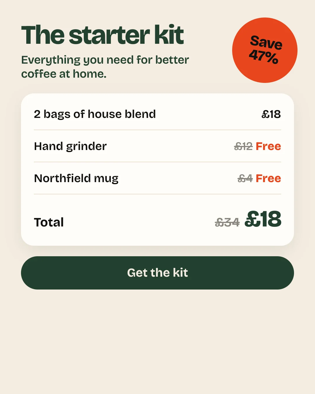
Some of the longest-running ads we found were offers to lapsed customers: one pet brand has run “we’ve missed you” discounts since March. Audiences of lapsed customers keep refreshing, so the same ad keeps meeting new people.
9. The note or letter
A founder’s note, a handwritten sticky note, or a plain letter. One pet food brand’s long-runner is a sticky note written in the dog’s voice. Another runs a plain “We miss you” letter that answers the subscription objection directly: pause, skip or cancel whenever you like.
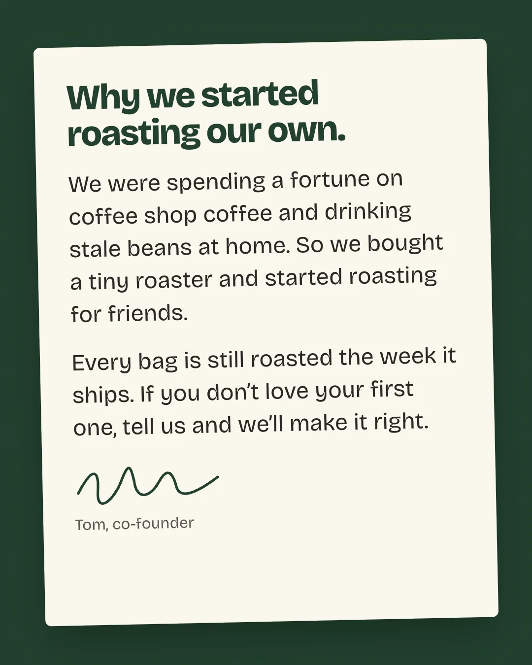
Notes work because they read like a person talking. Keep the language plain and sign it with a real name.
10. The editorial page
A static made to look like a magazine page: masthead, byline, a long headline and two photos. A beauty brand’s long-runner opens with a striking comparison in the headline and reads like an article.
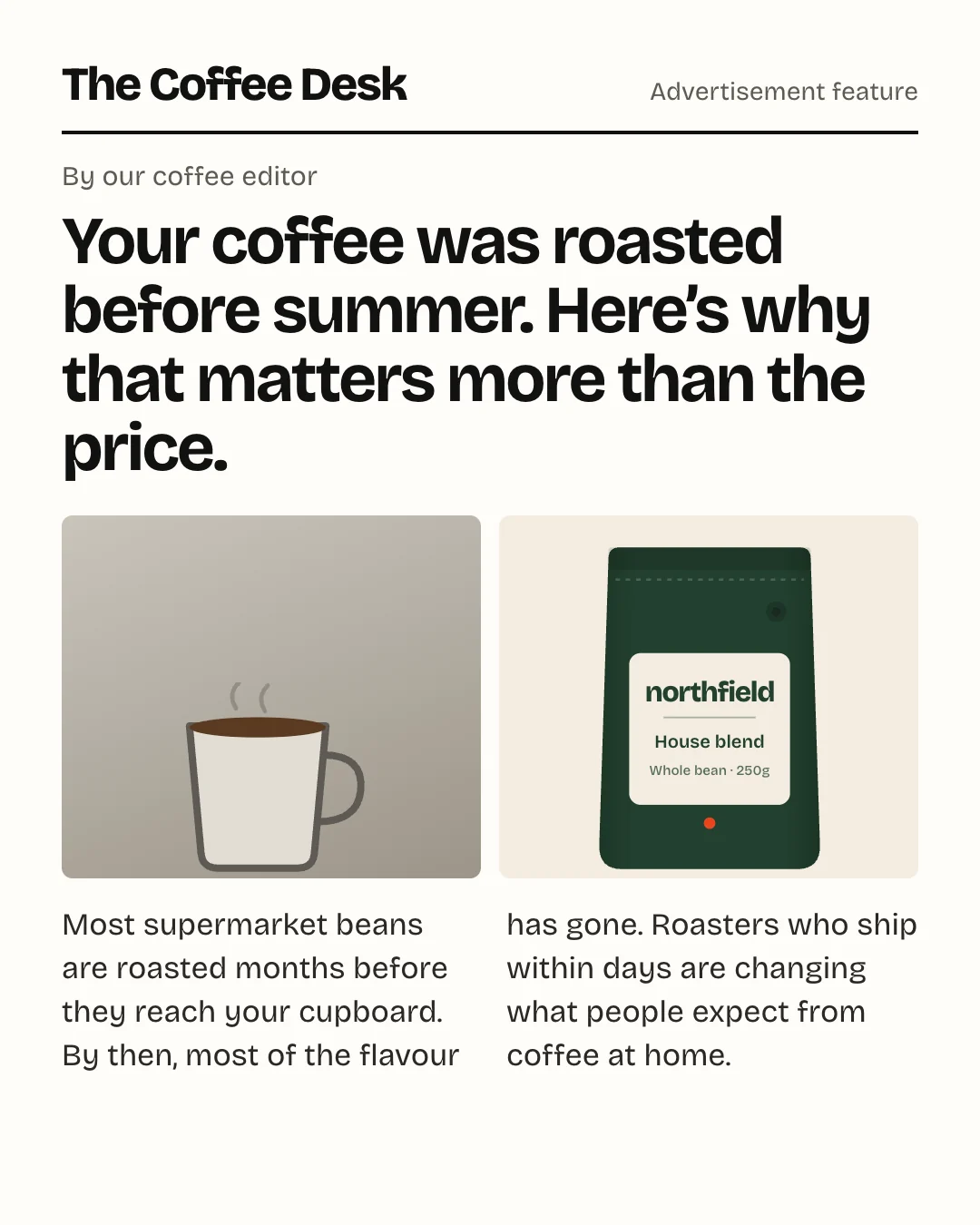
Use your own masthead, never a real publication’s, and make sure it’s clear it’s an ad. The format earns attention because people read it, so the headline has to be worth reading.
11. The native screenshot
A notes app list, a text conversation, a social post. These look like content rather than ads, which is why people stop for them.
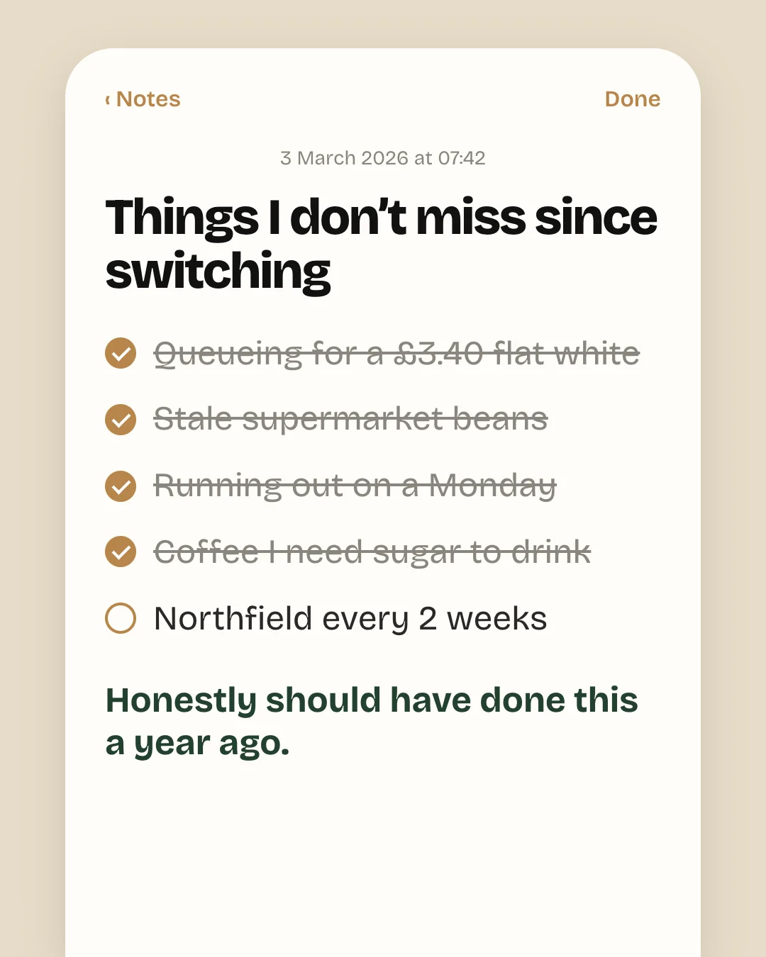
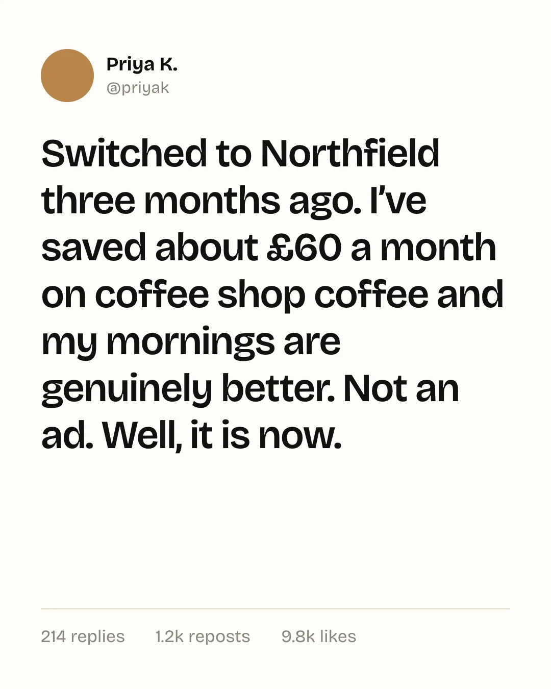
Whatever you show has to be real or clearly representative. Don’t invent customers, and don’t fake likes or replies.
12. The plain photo
Sometimes the best static has almost nothing on it. An activewear brand’s longest-running ads were creator photos with only a small wordmark. A pet brand’s were clean pack shots with no text at all, with the offer in the copy instead.
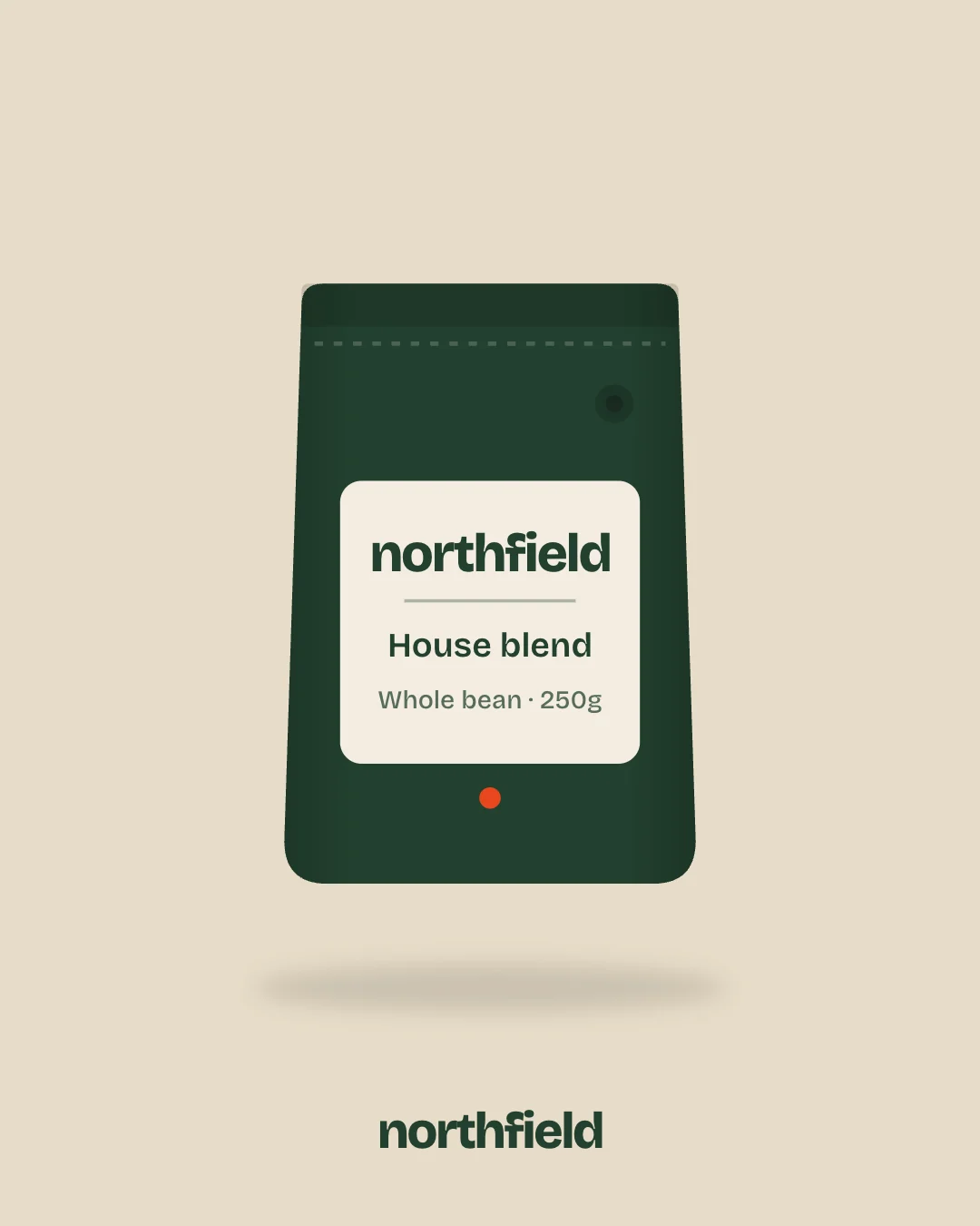
This works when the product or the person is the reason to stop: recognisable packaging, a creator people follow, or clothing that sells itself. Let the primary text and headline carry the argument.
How long-running statics get iterated
The brands with the longest-running statics rarely have one lucky ad. They have one good template and many versions of it: the same layout and the same copy, with a new headline, colour or product on top.
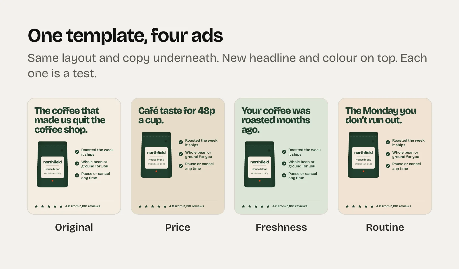
One caution. Meta groups ads that look nearly identical and treats them as one idea, so headline swaps are a cheap way to test messages, not a way to add new concepts. When you want a genuinely new concept, change the image and the angle, not just the words. More on that in hooks and angles.
How to judge a static
Statics usually lose to video on CTR. That’s fine. Judge them on purchases per 100 clicks and cost per purchase, because the people who click a static tend to have read it.
And when you look at competitors in the Ad Library, remember that the “started running” date belongs to the ad, not the idea. Duplicated or relaunched ads reset the date, so a concept can be much older than its ad. Several big advertisers we checked had nothing older than October, which looks like a seasonal relaunch rather than a lack of winners. To browse what’s live in your category, search the Meta Ad Library with a product keyword and your country.
Making them fast
- Brief one claim, one proof and one product shot per static. Anything else is a second ad.
- Make three colourways of every new template from the start.
- Size for placements: 4:5 for feeds and 9:16 for Stories and Reels, with key text kept away from the top and bottom, where the interface sits.
- Put the long version in the copy. Several long-running ads we saw paired a simple image with long primary text and a tick list of benefits.
- Check them on a phone at arm’s length before they go live. If you can’t read the headline, nobody will.
For the numbers to watch once they’re live, see the Meta ads metrics that tell you if an ad is working.